It's been just under three weeks since Apple showed off the next iteration of its flagship operating system for iPhone and iPad - iOS 12. Earlier this week Apple released its second beta of iOS 12 to developers.
Having patiently skipped the first beta we couldn’t resist any longer, so we went about installing the iOS 12 beta 2 on our iPhone 8 Plus and iPad Air 2 (fully backed up of course) to see what’s what when used with our daily apps. Foolish or brave? Well, we’ll find out as we dig into some of the significant features.
Quick Verdict
Certainly in Beta 2 guise, iOS 12 has impressed with its performance and day to day reliability, exceeding our expectations following our previous experiences with iOS 11. Apple has focused some of its efforts under the hood, and it shows. While some felt underwhelmed when Apple announced iOS 12, it's the little things and attention to detail that has us looking forward to iOS 12's release this fall.
Installation & Setup
iOS 12 Beta 2 weighs in at 2.5GB for the iPhone 8 Plus and 2.15GB for the iPad Air 2. With the installation yielding no surprises and the setup screens conforming to the usual Apple fair.
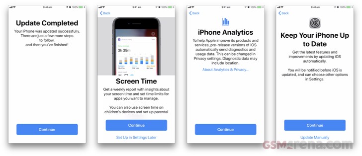 iOS 12 setup process
Setup is where we see two new features first raise their heads, namely Screen Time and Automatic Updates which we'll come to later in more detail.
Performance
Apple has made some bold claims regarding performance in iOS 12, explicitly highlighting older devices from the iPhone 5s and the iPad Air. With those claims focusing on:
- Up to 40% faster app launch
- Up to 70% faster swipe to Camera
- Up to 50% faster keyboard display
- Up to 2x faster Share sheet display under load
We started down the path of objectively testing every one of these claims, even going as far as capturing video for exact frame by frame comparisons. Two things became apparent though during this period. Firstly, we suspect that a number of the optimizations made by Apple will yield more significant results on older devices. And secondly, comparing beta versions of software with released versions isn't objective, especially when simulating loaded conditions.
Having said that, subjectively iOS 12 performed admirably, explicitly concerning the above list. It's this consistency that impressed the most, in all areas, no matter how often we repeat the activities the results appeared the same. Compare this to iOS 11, when you would experience some slowdowns on occasions and not others.
On both our test devices everything felt smooth and we experienced no slowdowns what so ever. While this may be expected on our A11 Bionic equipped iPhone 8 Plus, subjectively it felt that the iPad Air 2 showed marginal improvements. So we'll leave it at that for now and revisit at a later date with a full plethora of performance tests across a broader range of devices.
Grouped Notifications
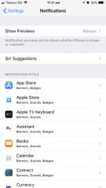
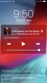
The first thing you're most likely to notice is the redesigned notifications which for many was frustrating at best, with Apple seemingly changing it with every release. Well now you can relax, notifications within iOS 12 have been overhauled and infused with added flexibility. Notifications are now grouped into easy to manage ‘stacks’ in your Notification Center and lock screen, while you can instantly tune each app while managing notifications.
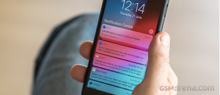
By default Notifications are now grouped in a stack, with the most recent notification on top.
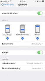
Touching the notification expands the whole list. The notifications can be compressed again by selecting Show less or dismissed completely by selecting X. As usual, you can slide each notification right to view. Sliding the notification to left shows the Clear & View options which has now been joined by Manage. Selecting manage brings up the Manage notifications dialogue for that app. This setting can also be shown by holding each notification and selecting •••.
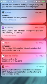
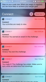
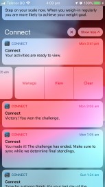
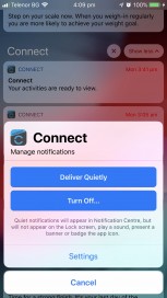
Grouped Notifications • Expanded stack • Manipulate individual Notifications • Tweak app Notification setting directly
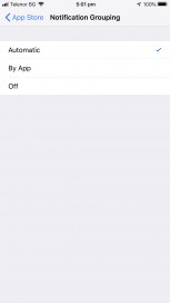
Additional nuances also exist in the way notifications are handled, very recent notifications are not immediately added to its respective stack ensuring that you don't miss it. While messages and threads for an app are kept in their stacks - this is the functionality enabled by the default Automatic setting.
If we're picky, the only negative observation we have with the new Notifications is that you can't apply a wholesale change to the notification settings for ALL or groups of apps. Being a beta though means this functionality could be added downstream.
Do Not Disturb
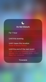
Following the trend laid down by notifications, Do Not Disturb provides more granular and automated control over Do Not Disturb.
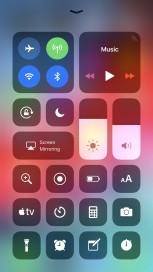
Long pressing the Do Not Disturb icon within the Control Centre allows you select the self-explanatory criteria for Do Not Disturb, with those criteria being intelligent based on time of day, location and events are in your diary.
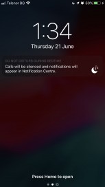
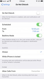
Apple didn't stop there though, we've also been graced with Bedtime Mode to block interruptions during our sleep. When enabled, during our scheduled Do Not Disturb hours the screen is dimmed and notifications will only appear in the Notification Centre - this respects your phone calls from favorite settings and if you have any contacts set up as Emergency Bypass.
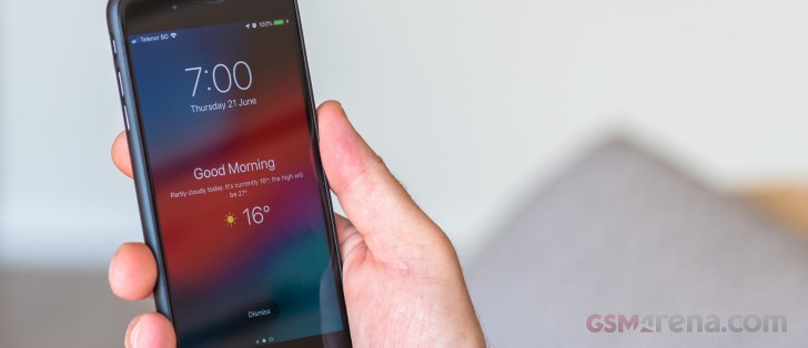
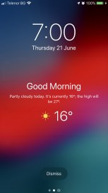
In the morning, everything returns to normal with your phone displaying a 'good morning' message and the weather forecast - a nice touch. When I showed this to my son he expected Siri to pronounce this - very Tony Stark, maybe in iOS 13.
Currrently, this is not enabled by default, in order to enable go to Setting>Do Not Disturb
Screen Time
Screen Time is Apple's response to calls from investors to address the public-health crisis concerning young kids and smart-phone addiction, and our course our own.
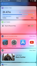
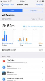
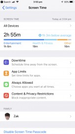
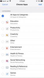
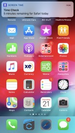
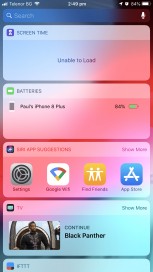
We first came across Screen Time via the Widget that is installed by default within iOS 12 which provides a summary of your usage, in our case broken down by Entertainment, Health & Fitness and other, other categories include Productivity, Social Networking, Reading & Reference and education.
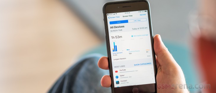
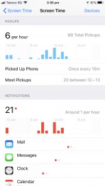
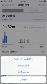
Crucially this is a consolidated view of all your devices that you have registered to the same iCloud account. Tapping the widget navigates you to the detailed breakdown of usage by app and website, number of times you picked up your phone, and the number of Notifications - these are also found within Settings>Screen Time.
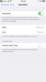
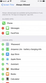
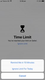
Of course, knowledge is only part of the solution. You're also able to set Downtime, App Limits, Always Allowed apps and Content & Privacy Restrictions for both your devices and more importantly your families devices. You can also completely disable Screen Time.
You'll be notified when you're near, or you've reached your time limit, on your own device you can blast through this limit.
Battery
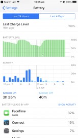
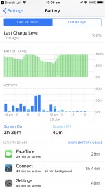
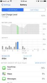
Battey information has been enhanced to provide a Battery Levels chart compared to the Activity chart over either a 24 hour or 10 day period. Additionally, the total time your screen has been on and off is also displayed.
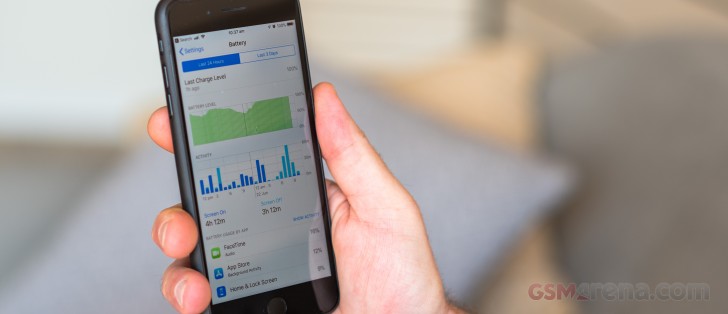
To provide an even more granular level of your battery status, you can select a one hour period to breaks down the app usage within that timeframe. A slight issue with the user experience is that once you start tapping into a time period, you can't go back to the total view without exiting the Battery settings altogether and reentering.
This is also an excellent juncture to talk about battery life in general. In this beta, surprisingly, we didn't notice any additional or adverse battery drain which bodes well.
Interestingly, The Battery Health feature introduced in iOS 11.3 is still showing its Beta tag, we expect this to leave its beta status behind when iOS 12 is released.
Photos and Camera
There are no real enhancements when it comes to taking pictures or video with iOS 12 that we discovered in our limited time with iOS 12. Where things have improved though is in the Photos app through the addition of the 'For You' tab that consolidates your Memories, Shared Album activity, and moments in your library. What we didn't see bubble to the surface during our testing was the New Featured Photos and Effect Suggestions which intelligently show you your best photos and propose effects to make them even better.
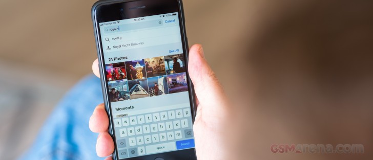
Searching for those cherished memories though has become more potent with iOS 12 as places/business can be searched, while multiple search parameters allow you to drill down to the find your photos even faster.
Measure app
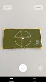
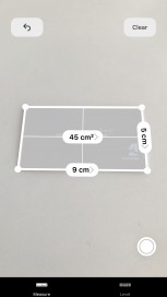
Apple have introduced a new app for iOS 12 - Measure. Doing precisely what it says on the tin, Measure uses AR to automatically measure flat rectangular surfaces and draw lines across surfaces to measure distances.
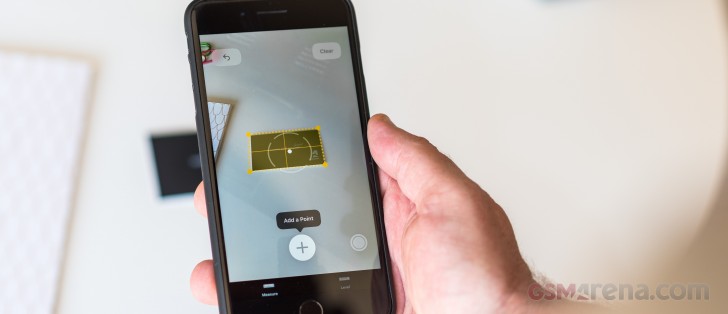
Retangular objects are automatically recognized as are corners making it relatively straightforward to measure your stuff. For now, at least, it can't yet identify circular items to measure diameters and circumferences.
As far as accuracy goes, it's just OK. In our ruler test, it was often 1-2cm off! Just don't use it for that precise granite worktop order for your kitchen and take it for what it is! While smart you'll probably only be using this for measuring smaller items or short distances.
For those that use it, the 'level' functionality that used to exist in the Compass app has been relocated to the Measure app.
Apple Books, Stocks, News and Voice Memos
With their upcoming debut on macOS, Apple took the opportunity to treat each app with a fresh coat of paint.
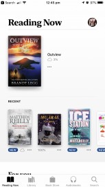
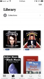
Apple Books - formally iBooks, Apple Books app has been completely redesigned in a similar vein to the App store within iOS 11. The redesign makes it easier to discover, read, and listen to books. The Reading Now tab allows you to access your current book or start a new one. And find new books the newly redesigned bookstore.
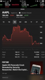
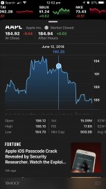
Stocks - Now also available on iPad, Apple News has now been integrated, replacing the previous news feeds, providing a richer more holistic view of your stocks. While the UI itself has been enhanced with a ticker and an interactive charts.
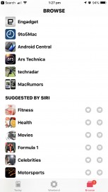
News - Apple news has probably undergone the fewest changes. The Browse tab now consolidates the channels you're following, Siri recommendations, saved stories and your history.
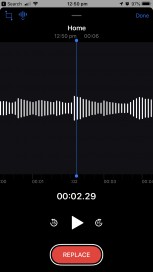
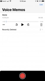
Voice Memos - While the core functionality remains the same, Voice Memos has undergone a complete redesign while also being available on iPad. Recordings should be synced across your iPhone and iPad via iCloud, but we couldn't get this working.
Other enhancements
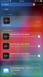
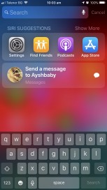
Siri Shortcuts - We're big fans of Apple's Workflow app which we detailed recently in our weekend APPertizers feature. It seems that the new Siri shortcuts apps are Apple absorbing this functionality into iOS 12. Unfortunately, in this beta, the Shortcuts apps aren't yet available. Over the course of testing though we did start to see Siri make more nuanced recommendations, for example, understanding who we text and when and offering to send a text.
Group FaceTime and effects - We were unable to test Group FaceTime as we couldn't find any other volunteers to install iOS 12 on their devices! However, we did play with FaceTime effects which allow you to embellish your appearance. These worked and added an element of fun to your video chats.
iPad
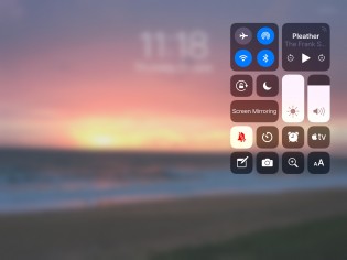
Gestures - Accessing the Control Center on the iPad was always rather inelegant within iOS 11. With iOS 12 Apple has adopted the gestures from the iPhone X. Control Center is now accessed by swiping down from the top right, with a useful Control Center indicator being shown on the lock screen as an aide-memoire. While making access to the Control Center more intuitive, if you thought it was hard to access on an iPhone X, on an iPad it's always a two-handed operation.
You'll also notice that the information displayed in the status area has been rationalized with some indicators locations changing. On the left, the text 'iPad' - as if we need reminding, and the WiFi strength signal has been replaced by the time and date, with the WiFI and Cellular indicators being now residing to the right of the display
.
This has freed up space now in the middle of the status area - either Apple is merely polishing the UI or this the clearest indicator yet that the next generation of iPads will have a 'notched' display whether a tablet form factor needs one or not.
Home gesture - you can now access the Home screen by using the same gesture as the iPhone X too. Takes some getting used to as on iPad you use the same gesture to pull up the Dock for multi-tasking. Flick to far or too quickly, and you get to the home screen accidentally.
iPhone Apps running on iPad - There will always be those apps that developers either haven't or won't update for iPad as the economies just don't add up for them. Previously, iPhone apps were displayed on iPad using an older iPhone model with a smaller screen size and quite frankly it made today's apps look odd. We're happy to see that Apple now uses a newer model, iPhone 6, with a larger display size ensuring that the scaled iPhone apps look more at home on the large screen real-estate.
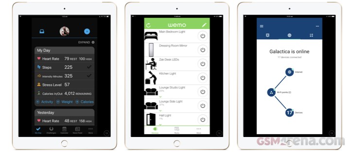 iPhone apps running on iPad finally utilize a modern iPhone size - iPhone 6
Glitches
Being a beta release you invariably come across the odd glitch or bug, and we did - but so far surprisingly few. We experienced no hangs or reboots during our use.
Final thoughts
Before the release of iOS 12, we fell on the side of the fence that hoped that Apple would slow things down, consolidate and enhance what was already in place as opposed to rushing headlong into adding new features. With our limited time with iOS 12, it looks like Apple has done precisely that. When we look back to this time last year and the issues we had with not only the iOS 11 beta but its subsequent release, its an order of magnitude better.











No comments:
Post a Comment